Do you remember walking into a doctor’s office and the colors leaving an imprint in your memory? Maybe it was the odd wallpaper pattern in the waiting room or the unappealing paint color that brings you some of those foul flashbacks.
You do not want to leave a negative memory in the minds of the patients walking into your healthcare center. Looking into the best colors for waiting rooms and doctor’s office paint colors that work well together could leave much kinder memories than the ones you may have from your childhood. The medical office color schemes your healthcare facility chooses can play a big role in how patients and staff feel during their time working or visiting the office.
Why Do Colors Matter?
Over 1,200 research studies recommend healthcare offices to focus on the design of their facility because it can benefit their patient care and, therefore, the medical support they give. Design can mean many things, but in the case of these studies, the design dynamic being focused on is color. Color is a very important element of design because it can impact the mood and feelings of those experiencing it.
What to Consider
Aesthetic
Every healthcare office has a unique aesthetic. Depending on the population you treat, the paint colors, décor, furnishings, and personality of the space all should be taken into consideration before throwing paint onto the walls. By looking at the furniture and materials in the space, you can work with the colors already present to create a good blend that will work well for your space. This works well especially when looking for the best colors for waiting rooms. By involving the flooring, countertops, and furnishings of the space, you can incorporate a good aesthetic.
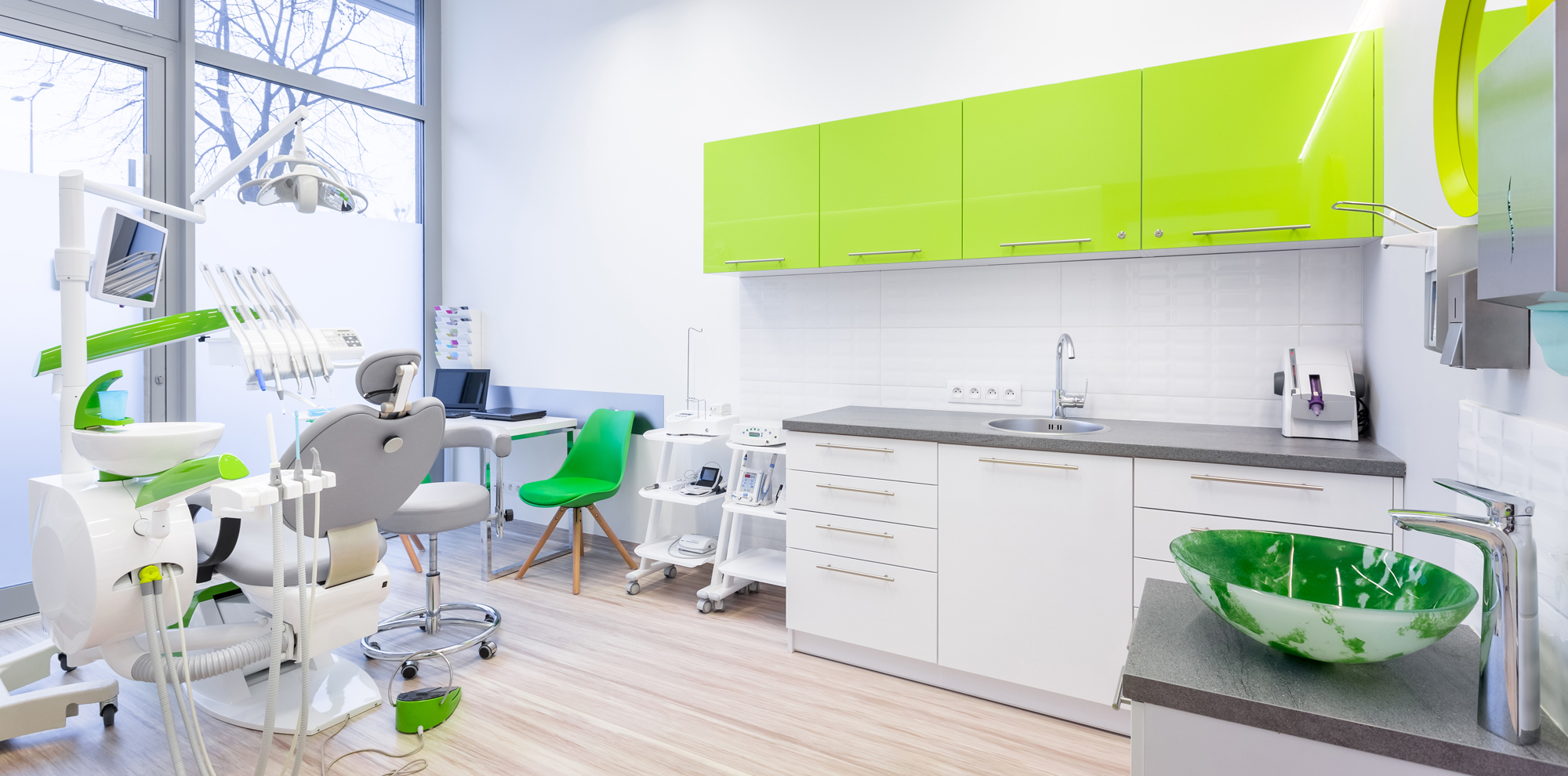
Color Moods
Just like the humans you treat, colors have moods as well. Becoming more comfortable with the science behind color moods can help you choose the best mix of colors for your doctor’s office. Thinking about colors that bring forth a sense of welcome (such as warm colors like yellow, red, and brown) can make patients feel more at ease when waiting for their appointment. Cool colors can also be useful when it comes to adding a relaxed vibe to your office. Cool colors such as green, purple, and blue are often seen in medical offices as well.
Red
Red can take on many roles in a space. While it can bring forth a sense of excitement or energy, it may also edge on negative, forward feelings. Finding a happy medium with the use of red can provide that bit of positive energy your medical office may benefit from.
Yellow
Yellow often represents vibrance and enthusiasm. This color, when used well, may brighten a patient’s day or lift them up after a tough appointment. Yellow can also be seen subliminally as a color of caution and can be used to highlight important themes.
Green
Refreshing and relaxing. Those are often the feelings shades of green radiate in a medical office space. When comfort is the number one focus, green can be the color to do just that. It isn’t a color that immediately heightens the senses or brings someone down. The neutrality of green is often a great component to be added into medical office color schemes along with other colors of comfort.
Population
Not every population is the same in every doctor’s office. While some medical facilities focus on pediatrics and primary care, others may only treat older patients or those with preexisting conditions. Taking into account who your office sees also plays a part in the colors you use. If you see more children than adults, you want the colors to attract and excite the little ones as well as make them feel comfortable. For older patients, the colors may be a little more subdued, but still work well in the space so the patients feel relaxed.